"Ten Tips for Dynamic Image Design
One of the things that separates a great photograph from a snapshot is the effort that the photographer put into designing the image. How many times have you looked at a great photograph of a very ordinary subject and marveled at the inventiveness that the photographer used in composing the image? And that is what image design is all about: being inventive in not only what you include in the frame, but how you place it in the frame and what tricks you use to emphasize certain aspects of the subject.
Below are ten quick tips that you can use to create more dynamic and interesting photos. If you apply just a few of these to your images, you’ll vast improvements in the “wow” factor of your photos almost immediately:

Use Selective Focus:
If you can’t simplify a subject by moving it (or moving yourself), you can toss a background out of focus by using a slightly longer lens and a wide aperture.
Play with Subject Placement:
It’s human nature to try and center subjects in the viewfinder (after all, that’s where the focusing indicators are) but break the habit. Place subjects high or low or radically to the left or right and you’ll add an element of power and surprise to your pictures. By placing this surfer in the lower right part of the frame, I was able to focus attention on him and yet show the environment as he was seeing it.
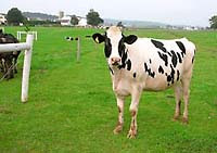
Simplify:
If a viewer has to ask what it is you were taking a picture of, you’ve blown the opportunity. Pare down each composition to its bare essentials. Less is always more.
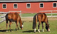
Move Closer:
One quick way to simplify any subject is to move closer to it. We tend to concentrate so hard on what is in the viewfinder that we think it’s larger than it is. As long as you’re not standing on the end of a dock, try taking a step closer even when you think you’re close enough.

Use Unexpected Angles:
Because we usually view the world from eye level and straight ahead, that’s how most of us compose pictures. Instead, try to imagine how a cat might see the world looking up at a rose bush instead of down at it. Kneel down on the ground, hop up on a porch or walk around behind a subject and shoot it from behind. The element of surprise is a wickedly powerful design tool.

Use a Plain Background:
Busy or chaotic backgrounds confuse the viewer about what you’re trying to shoot. If you’re photographing a subject that you can move, such as a person, find a plain background like a brick wall to simply the shot. Or circle the subject looking for a more plain backdrop. To get this photograph of a sunflower, I changed my position so that the background was a dark area of shadow and then I exposed for the sunflower only.

Vary Your Formats:
Just because your camera was design in the horizontal doesn’t mean you have to always hold it that way! Turn the camera vertical and try to think as a photojournalist: always looking for the great vertical shot for the cover of the magazine! Many subjects work well in either format, so take the time to shoot both and decide later which works best.
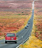
Create a Sense of Depth:
Use leading lines or “linear perspective” as it’s called to draw the viewer’s eye into the scene. Roads, lines of trees, telephone wires—anything that pulls the eye deeper into the scene will create a sense of distance and also lure the eye into exploring within the frame

Use a Frame Within a Frame:
Landscape photographers often use frames within frames to focus attention on a particular part of a scene (using a stone archway to frame a garden, for example) and it’s a very effective technique. But frames can also be used with other subjects, such as portraits—framing a shot of a farmer by shooting out at him from inside his barn, for instance. Frames are also an excellent way to hide distracting surroundings.
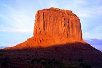
Create a Sense of Balance:
Most photographic compositions contain a variety of “strong” subjects (dark or large objects, for instance) and a certain amount of “weaker” ones (the sky, open lawns, etc.). Finding a balance between these so that one doesn’t dominate the other is a delicate but important aspect of image design. Try using large areas of light sand, for instance, to balance a large dark rock formation on a beach or use a large area of sunset sky to balance off the weight of a large sailboat in silhouette. In this shot of Merrick Butte in Utah’s Monument Valley I balanced the large bright area of red rock with a dark area of shadow caused by the sun going below the rim of the valley."


No comments:
Post a Comment